Graph visualization is the prettiest thing when your work involves with more data. It is a better and perfect solution when you have hard-time with your data representation. You can depict your data in multiple ways like Line chart, Pie chart, Scatter plot etc,.
We had an interested challenging for one of our iOS application where we need to draw a real-time (live) curved line graph from stream of data received very frequently.
We did a quick research and tried some of iOS graph libraries (Charts, SwiftCharts,etc) and we faced some issues with the real-time plot. Some libraries are adaptive with our goal, but it was costly in pricing. Finally we ended-up in the classic & open source graph/chart framework called Core Plot. The better one!
CorePlot
CorePlot is a two dimensional (2D) graph plotting library which provides highly customizable way to render many types of graph/charts. It is purely build around using the Apple Core APIs like Quartz 2D, Core Animation.
Using CorePlot library, you can draw awesome graph/charts in iOS, macOS and tvOS. CorePlot come-up with good test coverage that prevents us from issues & bugs.
In this blog, I’m going to demonstrate the technical way of plotting curved line graph from live stream of data points using CorePlot.

Let’s visualize
To integrate CorePlot with your application, it’s a recommended way to install it through CocoaPods like below,
pod 'CorePlot', '~> 2.3'
and do pod install . The latest CorePlot version(v2.3 – released on Jan’20) is compatible with Xcode 11 and Swift 5.
Configure graph view
Once you imported CorePlot with your controller then drop a new UIView to your storyboard and assign it to CPTGraphHostingView .
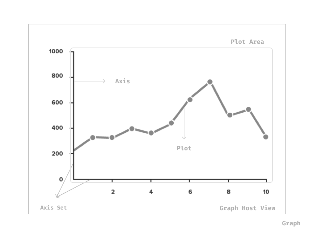
CPTGraphHostingView – a graph container where it holds your graph or chart view. This is the container object of CPTGraph
Then add these extension CPTScatterPlotDataSource, CPTScatterPlotDelegate to your controller to take care of data source & user interactions of your graph.
Core Plot has two delegate methods to display the data points on the graph:
-
numberOfRecords()– This method sets the number of data points the plot has. number()– This method returns the data point for each plot by using the plot identifier.
| import UIKit | |
| import CorePlot | |
| class ViewController: UIViewController { | |
| var plotData = [Double](repeating: 0.0, count: 1000) | |
| @IBOutlet var graphView: CPTGraphHostingView! | |
| override func viewDidLoad() { | |
| super.viewDidLoad() | |
| initializeGraph() | |
| } | |
| func initializeGraph(){ | |
| configureGraphtView() | |
| } | |
| func configureGraphtView(){ | |
| graphView.allowPinchScaling = false | |
| self.plotData.removeAll() | |
| self.currentIndex = 0 | |
| //Configure graph | |
| let graph = CPTXYGraph(frame: hostView.bounds) | |
| graph.plotAreaFrame?.masksToBorder = false | |
| hostView.hostedGraph = graph | |
| graph.backgroundColor = UIColor.black.cgColor | |
| graph.paddingBottom = 40.0 | |
| graph.paddingLeft = 40.0 | |
| graph.paddingTop = 30.0 | |
| graph.paddingRight = 15.0 | |
| //Style for graph title | |
| let titleStyle = CPTMutableTextStyle() | |
| titleStyle.color = CPTColor.white() | |
| titleStyle.fontName = "HelveticaNeue-Bold" | |
| titleStyle.fontSize = 20.0 | |
| titleStyle.textAlignment = .center | |
| graph.titleTextStyle = titleStyle | |
| //Set graph title | |
| let title = "CorePlot" | |
| graph.title = title | |
| graph.titlePlotAreaFrameAnchor = .top | |
| graph.titleDisplacement = CGPoint(x: 0.0, y: 0.0) | |
| } | |
| } | |
| extension ViewController: CPTScatterPlotDataSource, CPTScatterPlotDelegate { | |
| func numberOfRecords(for plot: CPTPlot) -> UInt { | |
| return UInt(self.plotData.count) | |
| } | |
| func number(for plot: CPTPlot, field: UInt, record: UInt) -> Any? { | |
| switch CPTScatterPlotField(rawValue: Int(field))! { | |
| case .X: | |
| return NSNumber(value: Int(record) + self.currentIndex-self.plotData.count) | |
| case .Y: | |
| return self.plotData[Int(record)] as NSNumber | |
| default: | |
| return 0 | |
| } | |
| } | |
| } | |
The
padding properties are offsets from the bounds of the hosting view.You can set up title for graph and style it using
CPTMutableTextStyle() Next we need to configure and scale axis for graph.
Configuring the axes
An axis is a line with respect to which a curve or line is drawn. The graph can have multiple axis. But basic graph will have just two axes, horizontal (x) and the vertical (y).
In CorePlot, each axis represented by class called CPTAxisand it also responsible for creating labels and ticks. The all axes in the grouped into a single object called CPTXYAxisSet .
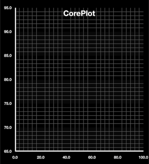
In our example, CPTXYAxisSet creates two axes, one for x(values) one for y (time in sec). We can create two axis with grids, ticks and labels like below,
| let axisSet = graph.axisSet as! CPTXYAxisSet | |
| let axisTextStyle = CPTMutableTextStyle() | |
| axisTextStyle.color = CPTColor.white() | |
| axisTextStyle.fontName = "HelveticaNeue-Bold" | |
| axisTextStyle.fontSize = 10.0 | |
| axisTextStyle.textAlignment = .center | |
| let lineStyle = CPTMutableLineStyle() | |
| lineStyle.lineColor = CPTColor.white() | |
| lineStyle.lineWidth = 5 | |
| let gridLineStyle = CPTMutableLineStyle() | |
| gridLineStyle.lineColor = CPTColor.gray() | |
| gridLineStyle.lineWidth = 0.5 | |
| if let x = axisSet.xAxis { | |
| x.majorIntervalLength = 20 | |
| x.minorTicksPerInterval = 5 | |
| x.labelTextStyle = axisTextStyle | |
| x.minorGridLineStyle = gridLineStyle | |
| x.axisLineStyle = lineStyle | |
| x.axisConstraints = CPTConstraints(lowerOffset: 0.0) | |
| x.delegate = self | |
| } | |
| if let y = axisSet.yAxis { | |
| y.majorIntervalLength = 5 | |
| y.minorTicksPerInterval = 5 | |
| y.minorGridLineStyle = gridLineStyle | |
| y.labelTextStyle = axisTextStyle | |
| y.alternatingBandFills = [CPTFill(color: CPTColor.init(componentRed: 255, green: 255, blue: 255, alpha: 0.03)),CPTFill(color: CPTColor.black())] | |
| y.axisLineStyle = lineStyle | |
| y.axisConstraints = CPTConstraints(lowerOffset: 0.0) | |
| y.delegate = self | |
| } |
CPTMutableLineStyle – used to style axis lines & grid lines. You can also assign alternative band colors to graph plots using alternatingBandFills .
Setting up plot space
Once you done with your axes configuration, then we need to set up a plot space graph range. Plot space is responsible for mapping your data coordinates to device coordinates (say view-port of graph view).
To plot the live data versus time, the time along the horizontal axis, and data value on the vertical axis. The space might range from min to max value that we set for axis.
| // Set plot space | |
| let xMin = 0.0 | |
| let xMax = 100.0 | |
| let yMin = 65.0 | |
| let yMax = 95.0 | |
| guard let plotSpace = graph.defaultPlotSpace as? CPTXYPlotSpace else { return } | |
| plotSpace.xRange = CPTPlotRange(locationDecimal: CPTDecimalFromDouble(xMin), lengthDecimal: CPTDecimalFromDouble(xMax - xMin)) | |
| plotSpace.yRange = CPTPlotRange(locationDecimal: CPTDecimalFromDouble(yMin), lengthDecimal: CPTDecimalFromDouble(yMax - yMin)) |
CPTXYPlotSpace is the instance which handles plot space of this graph and it have subclass that converts data coordinates into drawing coordinates.
The ranges of the graph are constrained by CPTPlotRange

Plot configuration
The representation of data in a graph is called as a “plot”. For example, data could be shown as a line or scatter plot, bar plot.
A graph can have multiple plots. Each plot can derive from a single data set, or different data sets. They are completely independent of one another.
To present a simple line plot of the data versus time, you need a value for the data at different points in time. To provide a plot with data using the data source approach, we set outlet of the CPTScatterPlot object, and then implement the data source methods.
The CPTScatterPlot class is used to draw line and scatter plots.
| func configurePlot(){ | |
| plot = CPTScatterPlot() | |
| let plotLineStile = CPTMutableLineStyle() | |
| plotLineStile.lineJoin = .round | |
| plotLineStile.lineCap = .round | |
| plotLineStile.lineWidth = 2 | |
| plotLineStile.lineColor = CPTColor.white() | |
| plot.dataLineStyle = plotLineStile | |
| plot.curvedInterpolationOption = .catmullCustomAlpha | |
| plot.interpolation = .curved | |
| plot.identifier = "coreplot-graph" as NSCoding & NSCopying & NSObjectProtocol | |
| guard let graph = hostView.hostedGraph else { return } | |
| plot.dataSource = (self as CPTPlotDataSource) | |
| plot.delegate = (self as CALayerDelegate) | |
| graph.add(plot, to: graph.defaultPlotSpace) | |
| } |
Animating the plot
Once you completed the plot & axis, then it’s time to show data flow in real-time. We can achieve this by animating the plot.
The integration of animation, which facilitates dynamic effects and interactivity. The Core Animation framework provides the mechanisms for positioning and transforming layers in time.
It’s just a very simple and short animate() method. The key here is to have the right fromValue and toValue for it to animate.
| let oldRange = CPTPlotRange(locationDecimal: CPTDecimalFromDouble(Double(range)), lengthDecimal: CPTDecimalFromDouble(Double(maxDataPoints-2))) | |
| let newRange = CPTPlotRange(locationDecimal: CPTDecimalFromDouble(Double(location)), lengthDecimal: CPTDecimalFromDouble(Double(maxDataPoints-2))) | |
| CPTAnimation.animate(plotSpace, property: "xRange", from: oldRange, to: newRange, duration:0.3) |
Whenever new data points come in, we adjust the X range to show the new point, animating the transition from the old X range to the new one.
The final output of graph seems like what we expected, it plots new data point (x value) in graph according time frame (y value) it comes in.

That’s all ! We achieved one of our goal with this awesome library. IMO, I recommend to consider CorePlot as a option whenever you need to work with complex data representation with graph/charts.
I hope you enjoyed the reading and learned something in the way. Thanks for staying in. Check out my Github repo for the full code base for this demo app and share your comments below.
